Kitchens By Design
Toggle Navigation
Toggle Navigation
Toggle Navigation
[Style Your Home] HIPSTER

HIPSTER – A PERSON WHO FOLLOWS THE LATEST TRENDS AND FASHIONS  Key word – latest.  Hipster decor as you know, is nothing new.  However, it is so cool and funky that we don’t see this fashion fading anytime soon.  As designers we like to keep things fresh, following trends while at the same time creating new ones.  Anyone can throw a goodwill collection together and call it hipster but if you really want your hipster to stand out, we suggest you follow these tips to keep your hipster up to date!

First off, a few hipster DONT’S…

The “KEEP CALM AND CARRY ON” print has got to go.  It is extremely over-done.  Keep calm and carry that print on out to the trash.  Please.

MASON JARS, MUSTACHES & RETRO EYEWEAR…oh my.  Need I say more?  Over-played.

TACKY CHRISTMAS STRING LIGHTS.  We love mood lighting but taking the lights off your Christmas tree and pinning them to your wall in a scalloped pattern looks juvenile and messy.

BADLY HUNG TAPESTRY/TOO MANY TAPESTRIES.  Tapestries can look pretty cool if placed in the right space.  However try not to cover your walls with hundreds.  This can look cluttered, block natural light and potentially make your space look smaller.

BOB MARLEY POSTERS.  Over-done.  We get it.  He was cool. He was a rebel, he smoked pot.  But unless you truly madly deeply love him, refrain from plastering his face all over your walls.

GOOD DESIGN IS A LOT LIKE CLEAR THINKING MADE VISUAL – Edward Tufte  When designing any space, it is important to take your time.  Think about the look you are trying to achieve, the palette you want to use and the vibe you want your space to exude.  Creating a hipster decor takes time; it is almost like a collection process.  When we think of quality hipster design we imagine eclectic style with a minimalistic approach.  That being said, keep in mind these hipster DO’S when creating your perfect space!

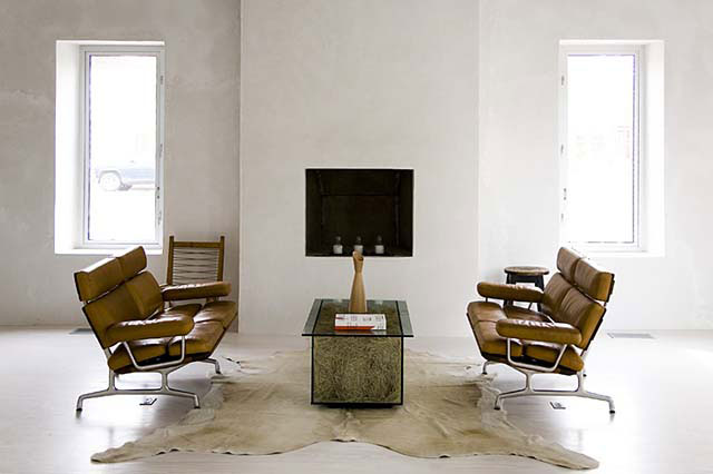
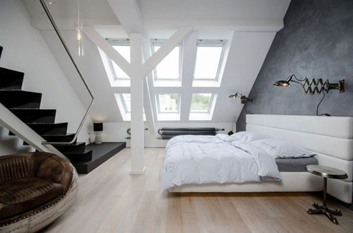
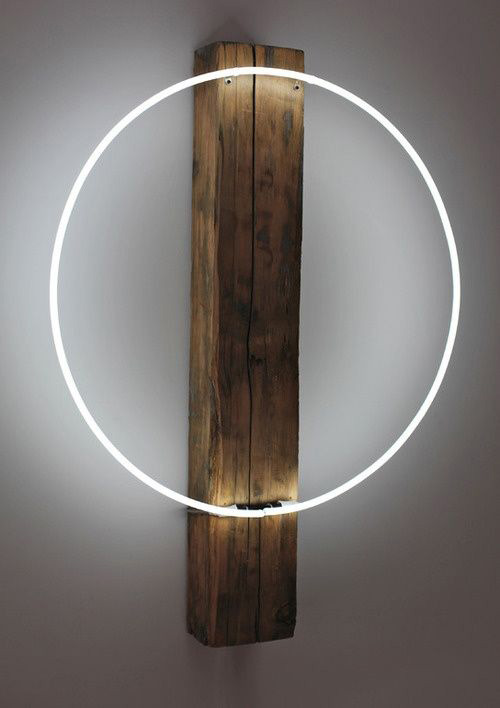
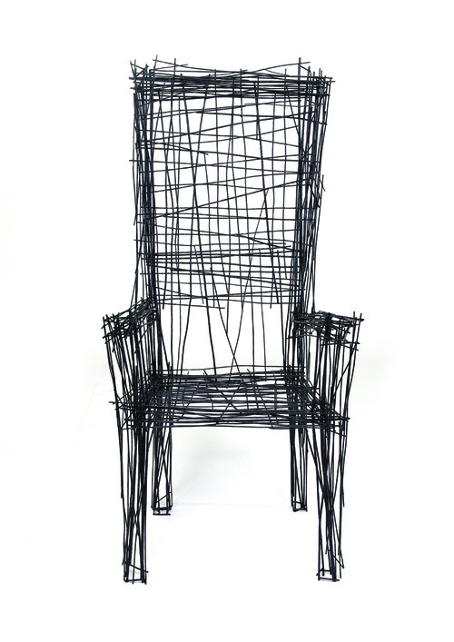
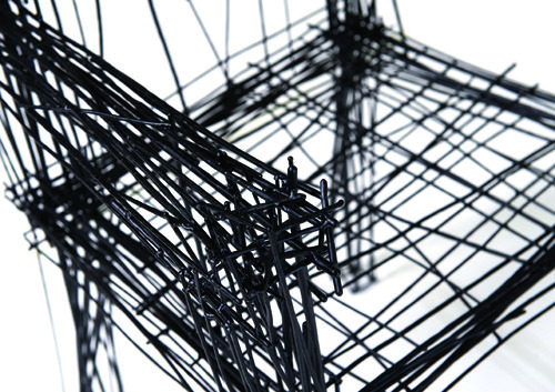
GET INDUSTRIAL.  Every hipster space needs a little masculinity.  Some ways to achieve this can be adding a brick accent wall (no, don’t make one – brick wallpaper works wonders if you don’t have an existing brick wall).  Having brick warms up your space and gives it an urban loft feel while keeping your trendy hipster style.  Another must is the use of metal and/or wire, distressed wood and our most favorite, exposed Edison light bulbs!

image

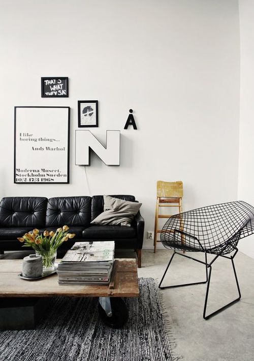
photo via myparadissi.com

image

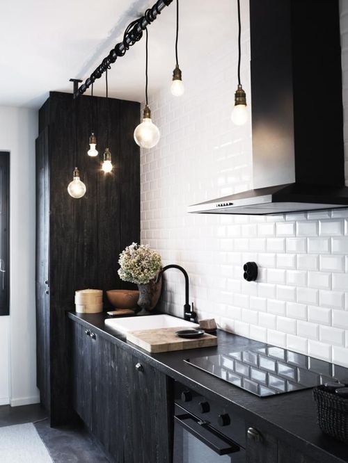
photo via remodelista.com

image

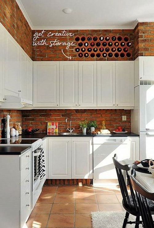
photo via Coco+Kelley

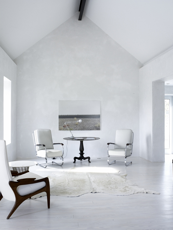
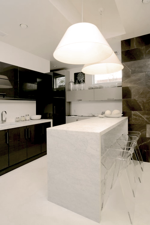
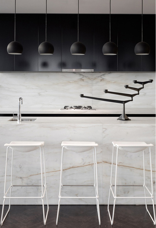
GET MOODY.  Think outside the box with your color palette.  For walls, fabrics and furniture use rich, bold colors.  Consider painting one wall a dark, moody color.  This creates a focal point of interest and is the perfect palette for lighter objects to really pop!  However, keep in mind less is more – balance out your bold colors with stark whites or creams.  And the simple key element, mismatch and layer.

image

image

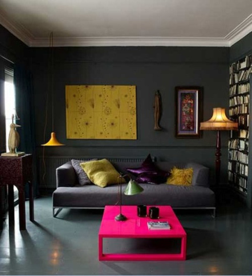
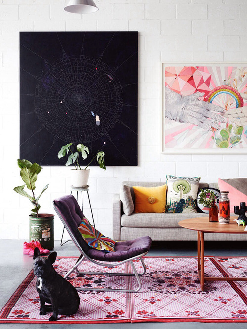
photo via Gray Livin’

image

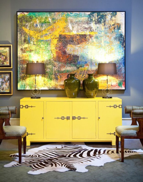
photo via garyriggshome.com

GET IT TOGETHER.  We can all agree frame walls are a must.  Hanging up anything and everything without any rhyme or reason however is not a must.  When creating your frame wall, stick to one or two colors for your frames. This creates a more cohesive look even though what’s inside the frames will vary.  Adding a letter, number or sentimental object(s) into the mix is also a nice touch.  This gives the wall dimension and keeps it from looking too match-matchy.
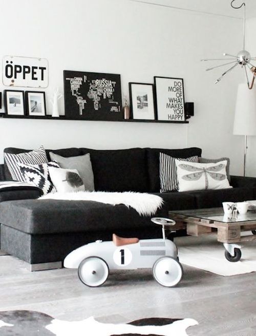
image

photo via lowehome

image

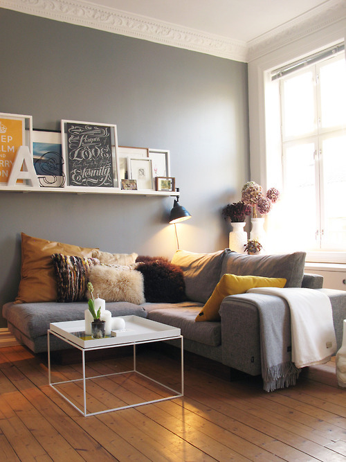
photo via Home Sweet Home

image

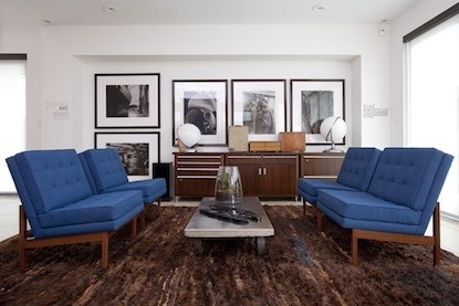
photo via K+BB Collective

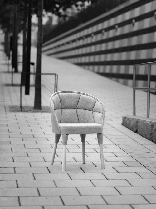
GET THRIFTY.  A big characteristic of the hipster style is vintage furniture and accessories.  Less is DEFINITELY more when it comes to vintage furniture.  You don’t want your space looking like a Goodwill catalog (if they had one).  But a few pieces of cool, worn and old furniture are totally okay.  For new furniture, again use bold colors with vintage bodies, fabrics, etc.  Using more furniture that is new with a vintage style will keep your space looking clean and fresh – too many pieces of vintage start to look like grandma’s living room.

image

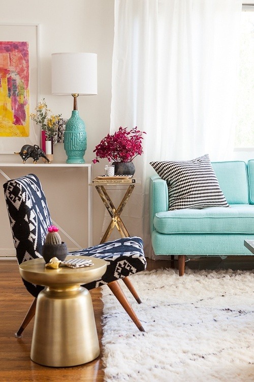
photo via Jessica Tocko

image

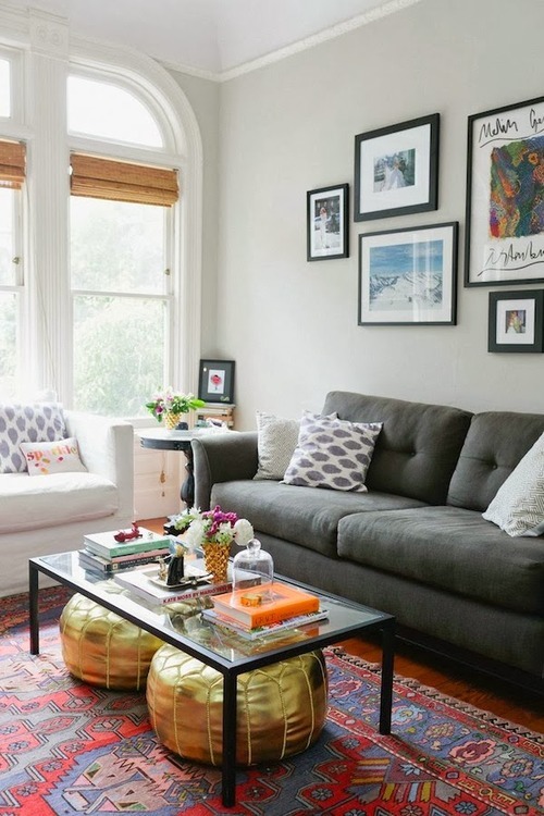
photo via dailycrush.net

GET A CAT.  Cats are cool and they look super hipster walking around your hipster space.  Moral of the story:  Show what you love.  Let your room showcase your hobbies, taste in music and personal style.  These are guidelines to help you not rules.  So be creative, have fun and feel free to share with us your beautiful spaces!

Always, KBD [the Creative Accomplice]
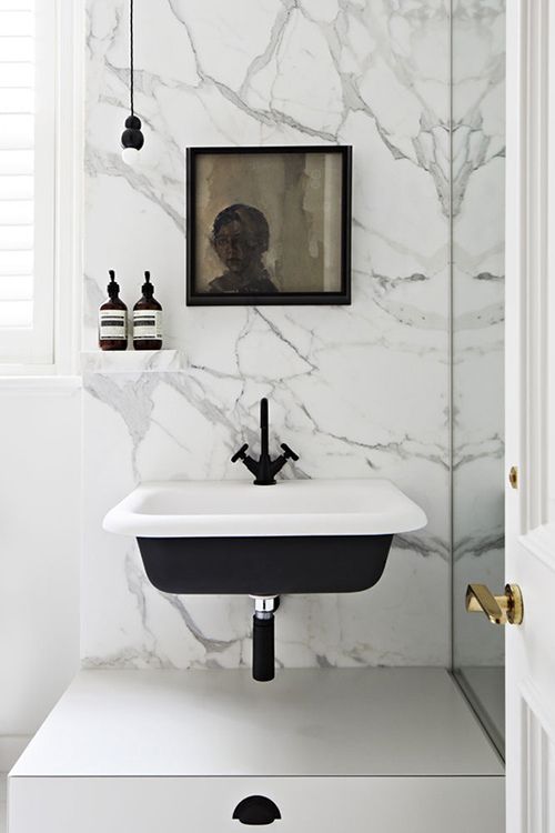
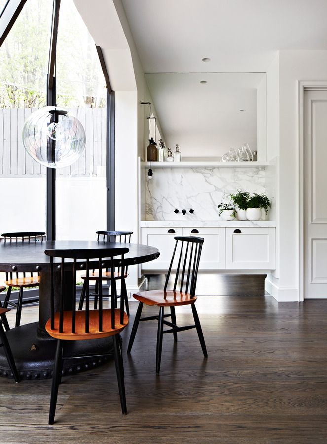
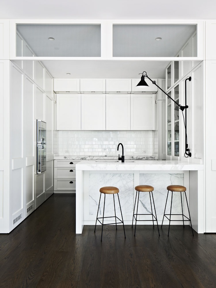
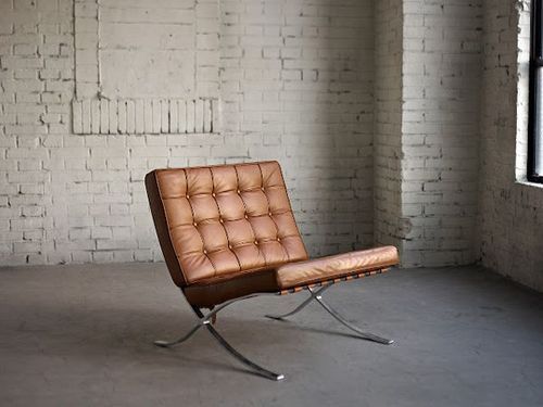
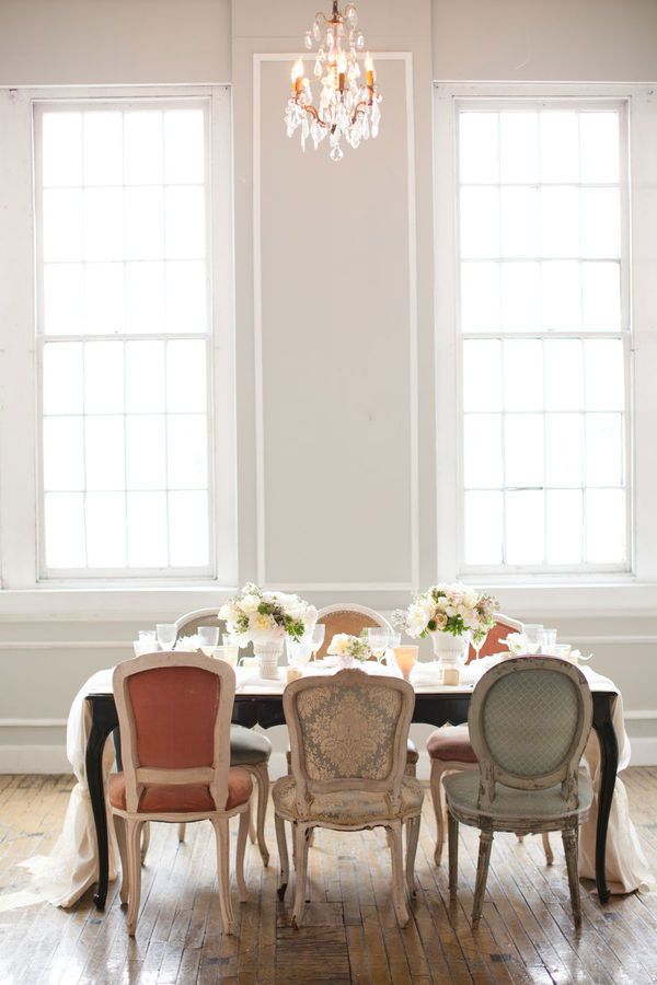
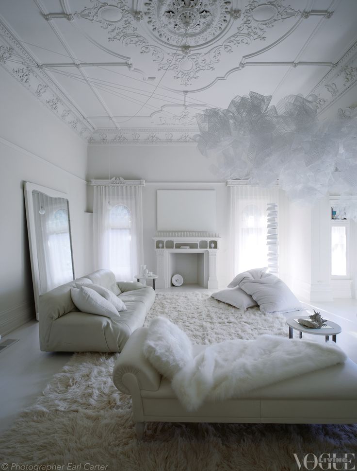
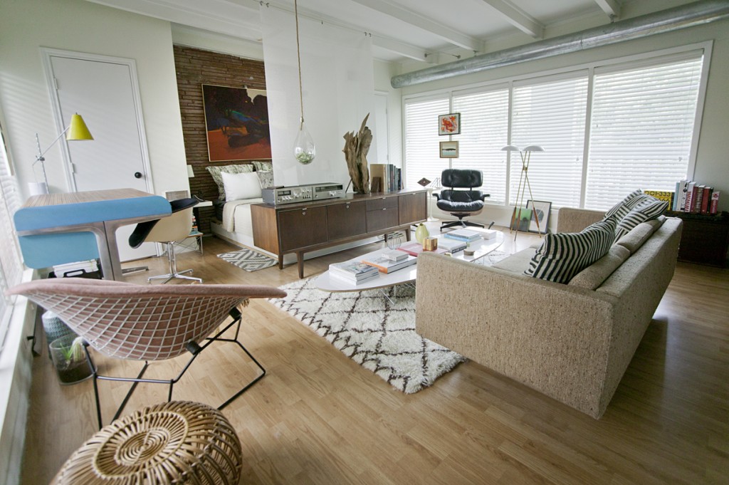
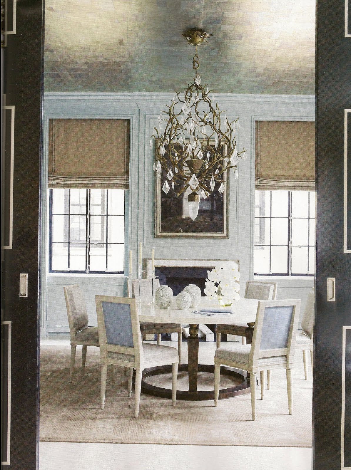
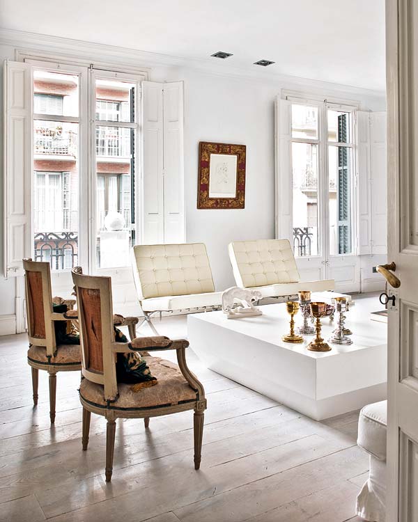
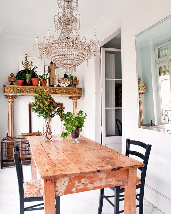

[TREND] All Marble Everything

Back in 2008, it seemed like Raf Simons cracked a case for a rock we all know and love. Applying its naturally intriguing qualities to clothing seemed like a novel concept. And people caught onto the stunning stone’s use in non-traditional applications. The trend has stuck around and we believe it’s one to watch.

image

Raf Simons for Jil Sander Fall 2008 Menswear via style.com

Another favorite designer, Jeffrey Campbell, applied this paleo-pattern to his leather Roswell boot for a mix of hard and soft. The versatility of marble’s natural coloring can pack a punch or turn a sole into a stately sculpture.

image

Jeffrey Campbell’s Roswell Boot via nastygal.com

Seventh Wonderland’s Huile Marble one-piece swimsuit makes for a statuesque surf.

image

via Seventh Wonderland

Australian interior designer, Paul Hecker, infused a timeless modernism into the Toorak residence where he used the perfect amounts of marble to make to seem as if he took a chisel and mallet to carve out this home that has a chilly stoicism and a warm friendliness, simultaneously.

image


image

image

photos via thedesignfiles.com

Simply breathtaking.

These marble plates make eating as much of an adventure as visiting a museum, standing awestruck as a witness to the skill and patience it takes to give this cold stone a pleasant warmth.

image


Independent artists from Society 6 have caught onto the beautiful simplicity of marble used in home decor. This Italian Marble Rug by Cafelab is a wonderful accent to any entryway.

image

via society6.com

Rather than sending a boring plain white envelope, this Marmor stationery by Europapier offers a sophisticated solution to escaping the norm while remaining timeless.

image

photo via europapier.com

The elegance of marble is apparent wherever it’s used. And we love these marble Buddha sculptures available here, at KBD Home.

image

We have a feeling marble isn’t going anywhere soon.

Where do you think we’ll see it next?

Always,

KBD


Friday in Fashion: Summer Leather

Leather has always been somewhat of a sultry fabric. But it’s never been a very breathable one.  Here’s to continuing to smolder this summer without suffocating.

Photographer Candice Lake caught fashion editor, Taylor Tomasi Hill, looking effortless and sexy in Paris. Donning this leather dress with a cinched waist, Hill looks put together and still breezy. The absent sleeves and the skirt length and shape, leave breathing room to pull off this look in the summer sun.

image

Photo via Candice Lake

Leather shorts make looking put together so simple. A plain, loose white tee makes for a chic day look. The juxtaposition of soft fabrics and harder leather creates interest. Choose a breathable cut for an airy sophistication.  

image

Photo via The Fashion Latte

Even in the summer heat, a change of hue can make a difference. If the sun is beating down and you still want your outfit to look bohemian chic, try a camel colored leather. You’ll attract less rays and more notice. This jacket is sexy-cool and has some extra fringe benefits.

image

Photo via Fashion Tag

If you’re absolutely overcome with warmth, ditch the sleeves and opt for a enticing vest. There’s no easier way to look like you just care enough.

image

Photo via Trop Rouge 

If there is one thing Mirte V. knows, it’s how to simmer in leather heels. These pointed, strappy beauties turn this super relaxed outfit into a fashion focused ensemble.

image

Photo via Mirte V. at lookbook.nu

Leather used in the home can be as versatile, seasonally. Use leather as much for its physical nature as you do for its aesthetic appearance.

Keep leather in the shadows as much as possible so it provides a cool place to rest indoors, even if this means rearranging your room. Keeping it out of the direct sun will also keep it from fading and cracking. 

This camel Barcelona Chair by Iconic Interiors is sexy, sophisticated and a color that works well with the changing seasons.

image

Whichever way you style it, this product of mother nature (as all of her creations) will remain a classic.

Always,

Erin for KBD


6 Design Myths Debunked

People get into ruts with design. No need to repeat these design myths any longer.

Myth #1: Everything has to match.

How do you expect to have an elegant place to eat if everything doesn’t match? Easily. These distressed vintage chairs evoke the same feelings but they certainly aren’t the same color or style.

image

Photo via KT Merry 

Myth # 2: Variety only exists in color and pattern.

Any monochromatic space offers a new and exciting challenge of creating contrast with texture, shape and size. Engage all the senses to create a design experience that envelopes you rather than screams at you. This all-white room from Vogue Living is a perfect example of contrast and interest.

image

Photo via Vogue Living 

Myth #3: That has to go against the wall.

Designer, Chris Nguyen, curated his personal studio space where very little actually is sitting flush against a wall. It keeps the space breezy and open. His artwork is suspended between two windows, his couch compartmentalizes his spaces and his room divider replaces a bulky awkward TV by doubling as a projection screen.


image

 Photo via Analog Dialog

Myth #4: Being trendy is foolproof.

Your personal style may go through phases, but at the core you are less volatile than most magazines suggest you should be. Accessorizing may be where you rotate your newest favorite color or pattern but don’t make the mistake of choosing expensive pieces that you’ll be over tomorrow. You’re not changing that much and your space should reflect that timelessness.


Myth #5: The ceiling needs to be white.

Why? It won’t necessarily open up your space and make it look larger. The eye will often ignore a white ceiling, keeping the eye from moving upward. Painting a ceiling two shades lighter than the walls adds interest and draws the eye upwards, mimicking higher ceilings.


This metallic ceiling in this David Kleinberg design certainly draws the eye upward and performs a key function to making a room look and feel larger; it reflects the natural light.

image

Photo via David Kleinberg 

Myth #6: You have to stick to one style.

Why give a room a diagnosis? You’re limiting its potential. These two spaces from Nuevo Estilo prove that backing a space into a style corner is a mistake. Without the juxtaposition of Victorian and rustic, I could assert that this space would be much less interesting and most likely, less livable.

image

imagePhoto via Lusia Olaz

What other myths have you heard?

Always,

Erin for KBD


Recipe for A Sophisticated Easter Brunch

Cornstarch-stuffed creations and obnoxiously bright decorations may make for a kid-friendly holiday, but if there are no young ones running around this Sunday, you may opt for an adult afternoon complete with pretty cocktails and muted palettes.

We’ve collected some ideas that inspire us to create a simple, yet sophisticated Easter brunch.

Everything lifestyle blogger, Julie Blanner does, looks effortless. Her easter table from last year (and this year, too!) is no exception.


image

Photo via Coordinately Yours

Julie’s muted color palette keeps the celebration mature, but comfortable. The freshness of her design certainly lifts the spirit and channels the feelings of rebirth and resurrection of our hearts, mind and Mother Nature.


image

Photos via Coordinately Yours

Here are a few of our favorite details from her tablescape. The centerpiece is especially lovely, relaxed but purposeful.

Laura Zindel’s china dinnerware sets are always stunning. For this celebration, her Woodland collection would be especially timely and would sit beautifully atop the table Julie has curated.


image

Photos via Laura Zindel Design


Keeping it fresh and interesting is always easier with a beautiful fruit cocktail to start the day off. We were especially intrigued by Martha Stewart’s Little Rose Spring Cocktail. This milky, rosy mixture of Sauvignon Blanc, Muscatel and grapefruit juice is pleasing to both the eye and the taste buds. image

Photo via Martha Stewart


Brunch food is simply the best.

And when it comes to clean eating, Katie Ferrell of the Dashing Dish knows her stuff. These brunch recipes will make you feel good and remain guilt free.


image

Carrot Cake Protein Pancakes by Dashing Dish


image

Crustless Asparagus Quiche by Dashing Dish

And of course, no Easter celebration is complete without…


image

Skinny Deviled Egg by the Dashing Dish

 While being around friends and family is the most important part of every holiday, it certainly doesn’t hurt to enjoy one another in a beautiful space. 

Happy Easter All,

KBD


[FRIDAY FAVORITE] Barbara Hill

Turns out, less is more in Texas.

This applies specifically to designer, Barbara Hill, whose earthy minimalist designs combine man made material with natural nuances.

Each of her spaces are inspiring, leaving you with room enough in your brain for contemplation.


Spaces from the Marfa house:

image

Photo via Hill’s website

Hill’s high ceilings give this space breathing room and draws attention to the stunning marbled walls. Contrast is created using fabric rather than color and plays with the eyes to keep them moving.The porcelain wood floors function to keep the space physically and aesthetically cool.


image

Photo via Hill’s website

My favorite piece in this room is the coffee table. The juxtaposition between natural and manufactured products is characteristic of Hill’s designs and is showcased beautifully here.

image

Photo via Hill’s website

This very geometric tub looks as if it was left standing from ancient ruins. The natural light in all of Hill’s spaces, especially in this one, creates a sense of a synergy between the earthly and the heavenly.

image

Photo via Hill’s website

The bared metal of the bath’s faucet call to mind a picture of harvesting a natural spring, making this fixture a completion of the aesthetic.


Details from the Dancehall:

imageimage

Photos via dwell.com

Hill creatively displays her wardrobe that partions the space while letting light pass through. If she wants to open the room she can roll the cabinets on their attached skateboard wheels.

image

Photos via dwell.com

Hill defies the status quo by placing her stately tub in the very center of her bedroom complemented by the custom plumbing that seems to come out of nowhere.

Your designs are always inspiring, Barbara.

 Always,

Erin Stevens for KBD


Color Cure: Slate of the Union

It’s quite the dreary day here in Indianapolis.

But grey isn’t always depressing.

image

Architecture-inspired prints from graphic designer María Rut Dýrfjörð

These icy geometric prints nod at the imposing architectural styles of Guðjón Samúelsson. These would sit well against a yellow velvet sofa.

image

Emily Chair for Färg & Blanche

This quilted beauty makes me short of breath. The details are well thought out but come across as effortless, comfortable and classic. I want you, Emily.

image

Source: onekindesign.com

First of all, minimalism. Second of all, a grey accent wall. Thirdly, a SUEDE accent wall. Instead of experimenting with color to add richness and interest to a room, the difference can be in the mixing fabrics.

That’s the Slate of the Union, this Friday.

Always,

Erin Stevens for KBD


TREND+MINIMALISM

You followed the recipe to a T. But in hopes of making the dish more palatable, you added one more pinch of salt without first sampling your work.

The first bite would be your last.

What would have been a perfect combination of ingredients has become hard to swallow.

Minimalism is not the lack of something, but the perfect amount of it. Minimalist design often echoes the mantra of beauty and functionality combined.

image

Minimalist kitchen designed by Kristin Okeley, Kitchens by Design

image

Minimalist kitchen designed by architects Callum Fraser and Zahava Elenberg of Elenberg Fraser. Source: designmilk

Aesthetically, minimalism is often characterized by entirely black and white spaces. But it can be so much more. 

In ways, minimalist design challenges us to make the most of what we have. Maybe, more accurately, we should call it maximalism. A movement towards the combination of non-tradition materials is becoming is apparent.

image

Source: Pinterest

Certainly, simplicity begins in the mind. Over-thinking can lead to unnecessary clutter. And many of our greatest ideas come to us when we aren’t thinking.

Take for example, Jin Il Park who created this steel chair inspired by his own line drawings.

image

image

Steel chair by Jin Il Park. Source: designmilk

In at least one area of our lives we can afford less. And less can mean so much more.

Always, KBD