HIPSTER – A PERSON WHO FOLLOWS THE LATEST TRENDS AND FASHIONS Key word – latest. Hipster decor as you know, is nothing new. However, it is so cool and funky that we don’t see this fashion fading anytime soon. As designers we like to keep things fresh, following trends while at the same time creating new ones. Anyone can throw a goodwill collection together and call it hipster but if you really want your hipster to stand out, we suggest you follow these tips to keep your hipster up to date!
First off, a few hipster DONT’S…
The “KEEP CALM AND CARRY ON” print has got to go. It is extremely over-done. Keep calm and carry that print on out to the trash. Please.
MASON JARS, MUSTACHES & RETRO EYEWEAR…oh my. Need I say more? Over-played.
TACKY CHRISTMAS STRING LIGHTS. We love mood lighting but taking the lights off your Christmas tree and pinning them to your wall in a scalloped pattern looks juvenile and messy.
BADLY HUNG TAPESTRY/TOO MANY TAPESTRIES. Tapestries can look pretty cool if placed in the right space. However try not to cover your walls with hundreds. This can look cluttered, block natural light and potentially make your space look smaller.
BOB MARLEY POSTERS. Over-done. We get it. He was cool. He was a rebel, he smoked pot. But unless you truly madly deeply love him, refrain from plastering his face all over your walls.
GOOD DESIGN IS A LOT LIKE CLEAR THINKING MADE VISUAL – Edward Tufte When designing any space, it is important to take your time. Think about the look you are trying to achieve, the palette you want to use and the vibe you want your space to exude. Creating a hipster decor takes time; it is almost like a collection process. When we think of quality hipster design we imagine eclectic style with a minimalistic approach. That being said, keep in mind these hipster DO’S when creating your perfect space!
GET INDUSTRIAL. Every hipster space needs a little masculinity. Some ways to achieve this can be adding a brick accent wall (no, don’t make one – brick wallpaper works wonders if you don’t have an existing brick wall). Having brick warms up your space and gives it an urban loft feel while keeping your trendy hipster style. Another must is the use of metal and/or wire, distressed wood and our most favorite, exposed Edison light bulbs!
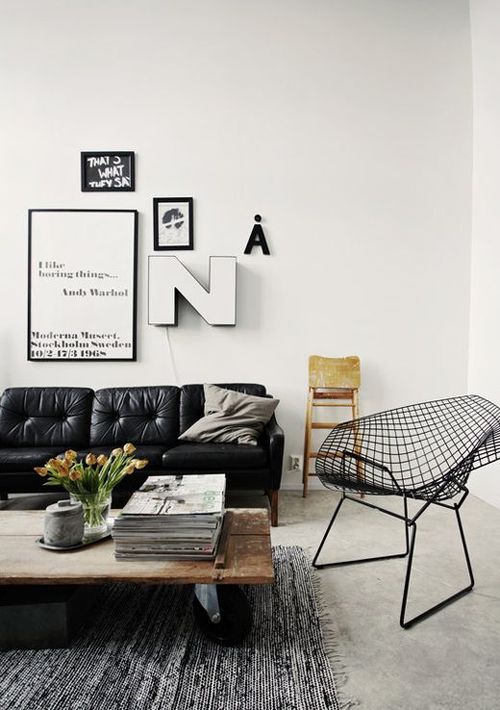
photo via myparadissi.com
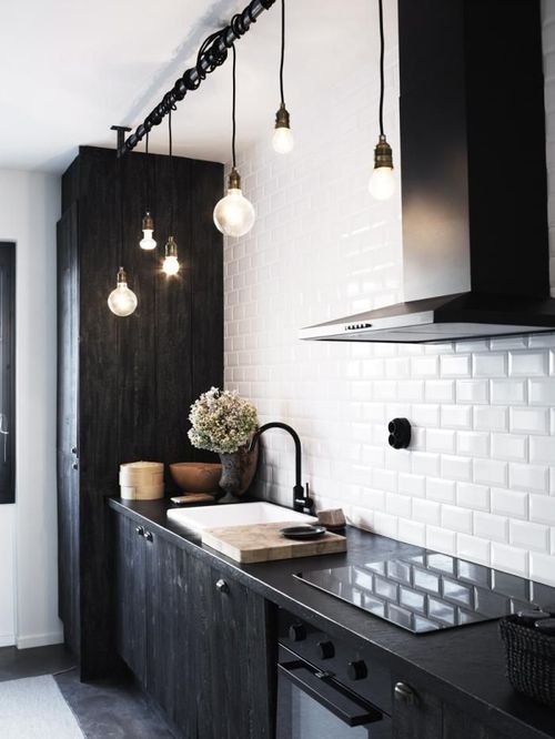
photo via remodelista.com
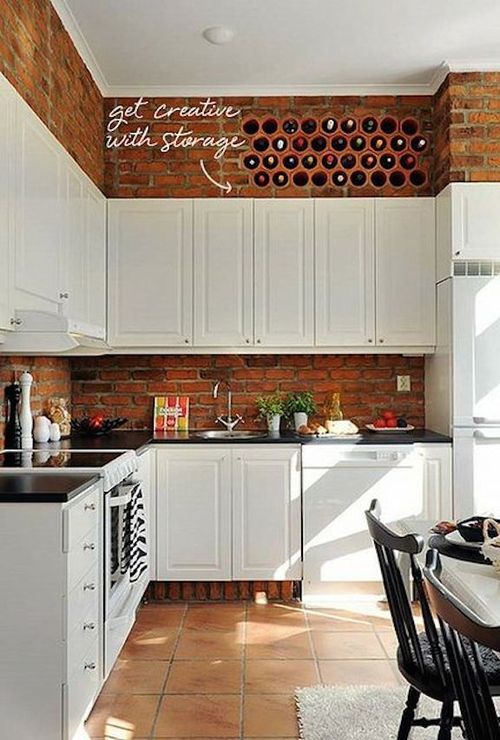
photo via Coco+Kelley
GET MOODY. Think outside the box with your color palette. For walls, fabrics and furniture use rich, bold colors. Consider painting one wall a dark, moody color. This creates a focal point of interest and is the perfect palette for lighter objects to really pop! However, keep in mind less is more – balance out your bold colors with stark whites or creams. And the simple key element, mismatch and layer.
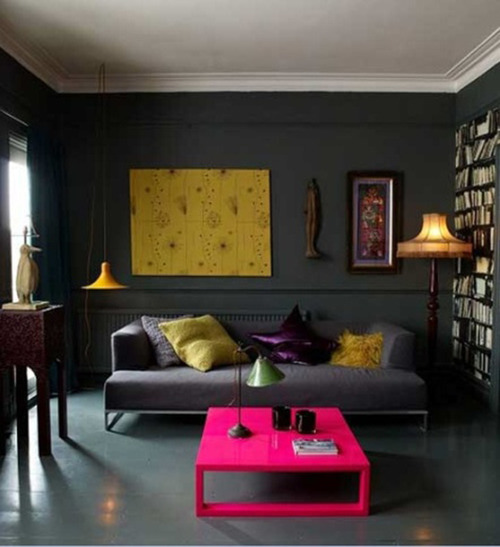
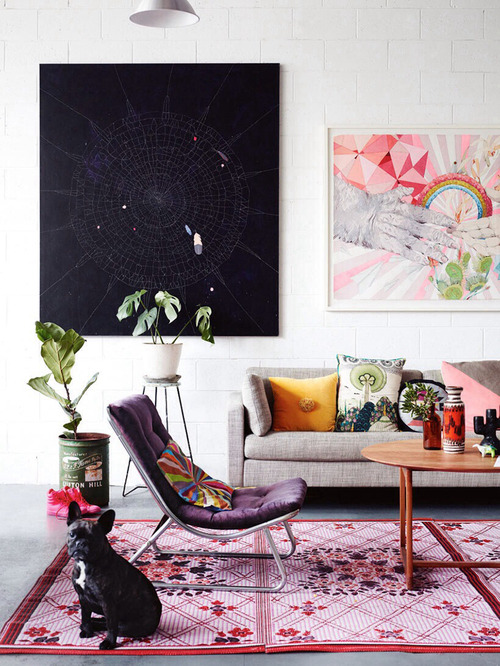
photo via Gray Livin’
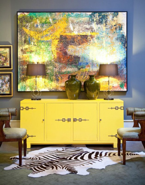
photo via garyriggshome.com
GET IT TOGETHER. We can all agree frame walls are a must. Hanging up anything and everything without any rhyme or reason however is not a must. When creating your frame wall, stick to one or two colors for your frames. This creates a more cohesive look even though what’s inside the frames will vary. Adding a letter, number or sentimental object(s) into the mix is also a nice touch. This gives the wall dimension and keeps it from looking too match-matchy.
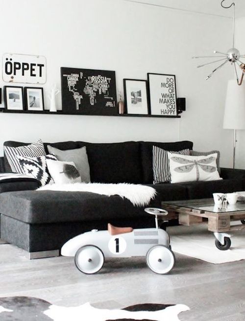
photo via lowehome
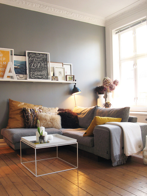
photo via Home Sweet Home
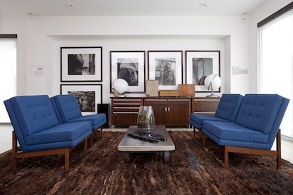
photo via K+BB Collective
GET THRIFTY. A big characteristic of the hipster style is vintage furniture and accessories. Less is DEFINITELY more when it comes to vintage furniture. You don’t want your space looking like a Goodwill catalog (if they had one). But a few pieces of cool, worn and old furniture are totally okay. For new furniture, again use bold colors with vintage bodies, fabrics, etc. Using more furniture that is new with a vintage style will keep your space looking clean and fresh – too many pieces of vintage start to look like grandma’s living room.
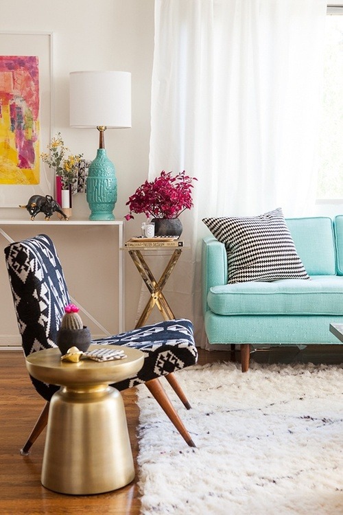
photo via Jessica Tocko
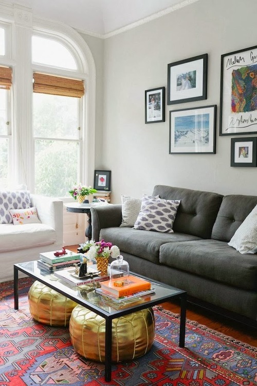
photo via dailycrush.net
GET A CAT. Cats are cool and they look super hipster walking around your hipster space. Moral of the story: Show what you love. Let your room showcase your hobbies, taste in music and personal style. These are guidelines to help you not rules. So be creative, have fun and feel free to share with us your beautiful spaces!
Always, KBD [the Creative Accomplice]
